Julia Sinner — Visual Design

TypeMate
Case Study

An older photo of a sign on a building: Club Tresor in West Berlin.
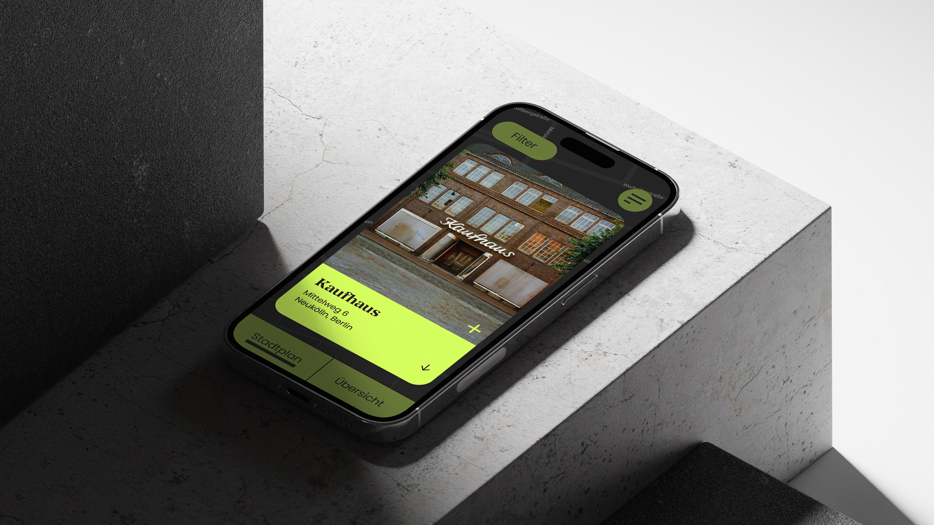
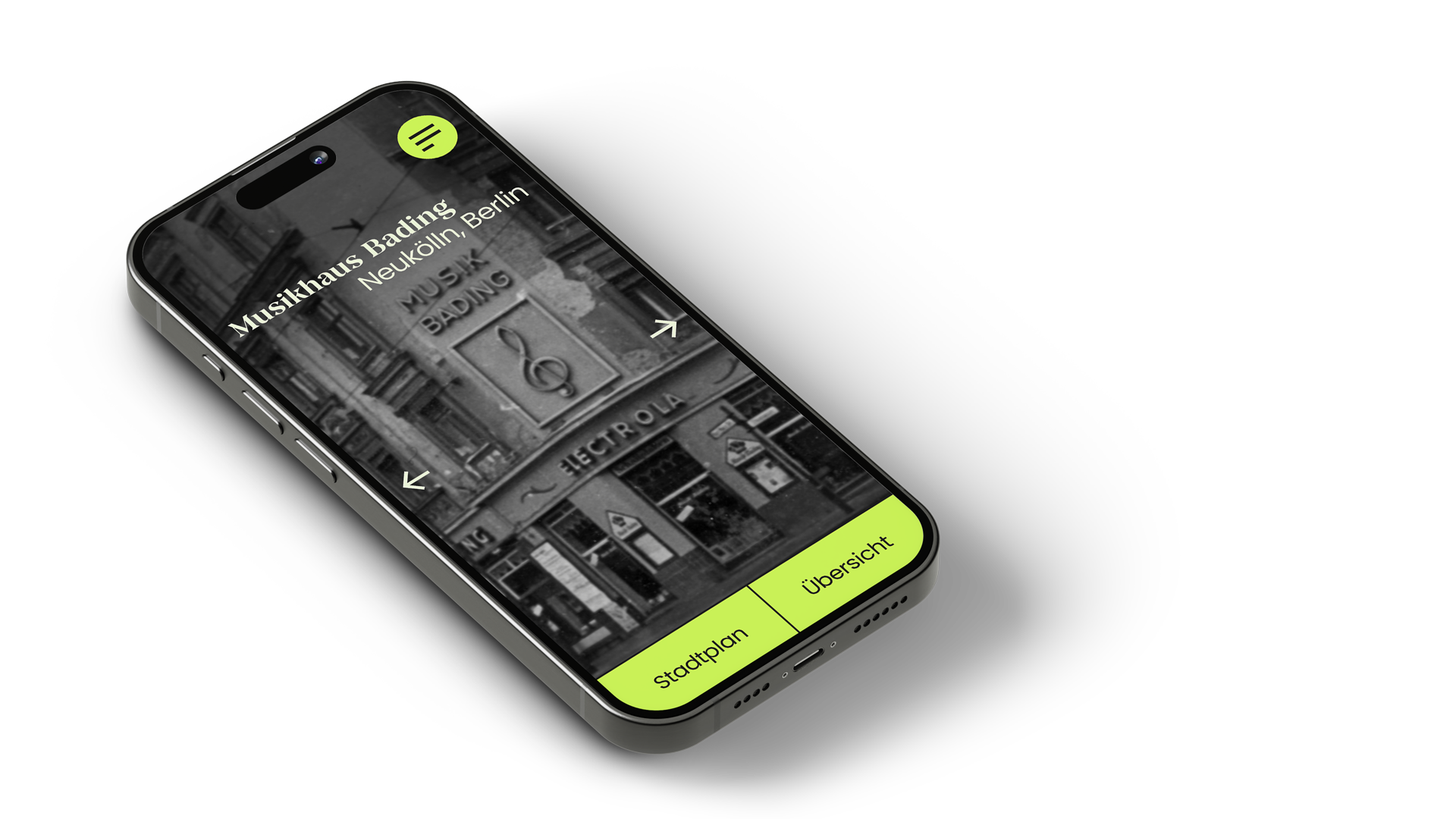
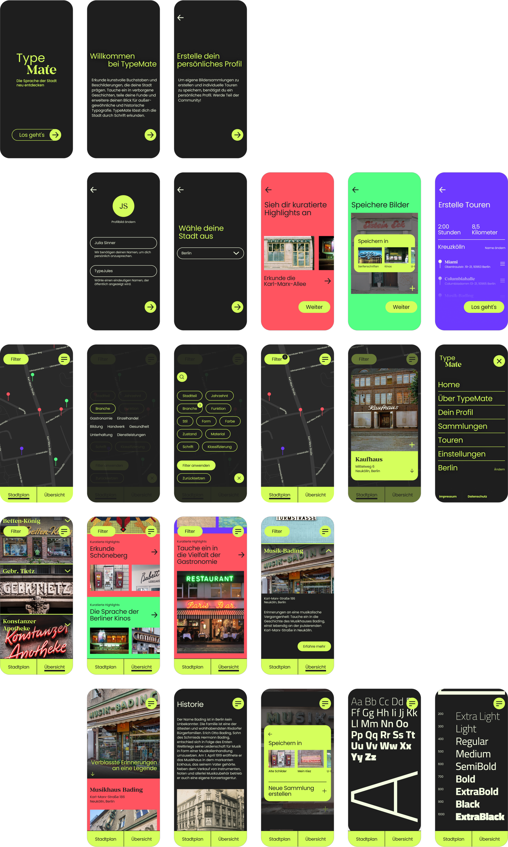
TypeMate is an application designed to explore typography in urban space. It provides users with the opportunity to discover the diverse range of fonts and signs that are part of our everyday life.
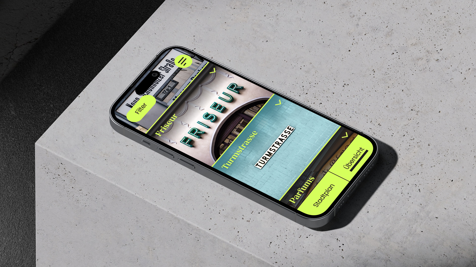
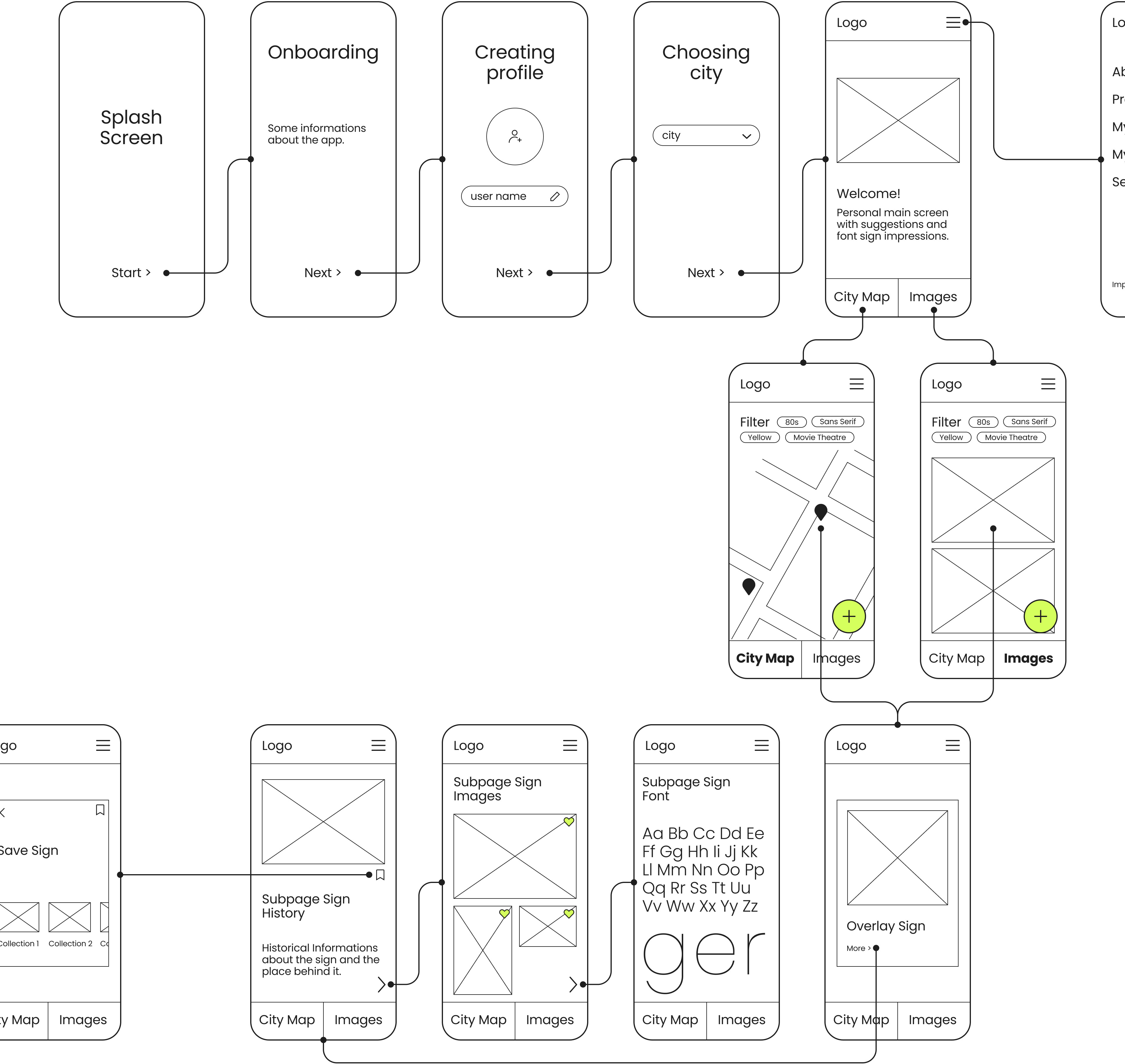
The app collects any enduring typography, including everything from street signs and former stores' names to current signage from cultural institutions. Users are provided with background information about the places, accompanied by high-quality photos, and insights into the fonts used in those settings.

The idea for the app emerged from my personal interest in signage from abandoned businesses whose names still adorn building facades. Each of these signs tells stories from the past, about people and their daily lives. I wanted to create an app to preserve these stories and share them with others.
2023
Figma
UX/UI Design Bootcamp
3
weeks
20+
screens
25+
components
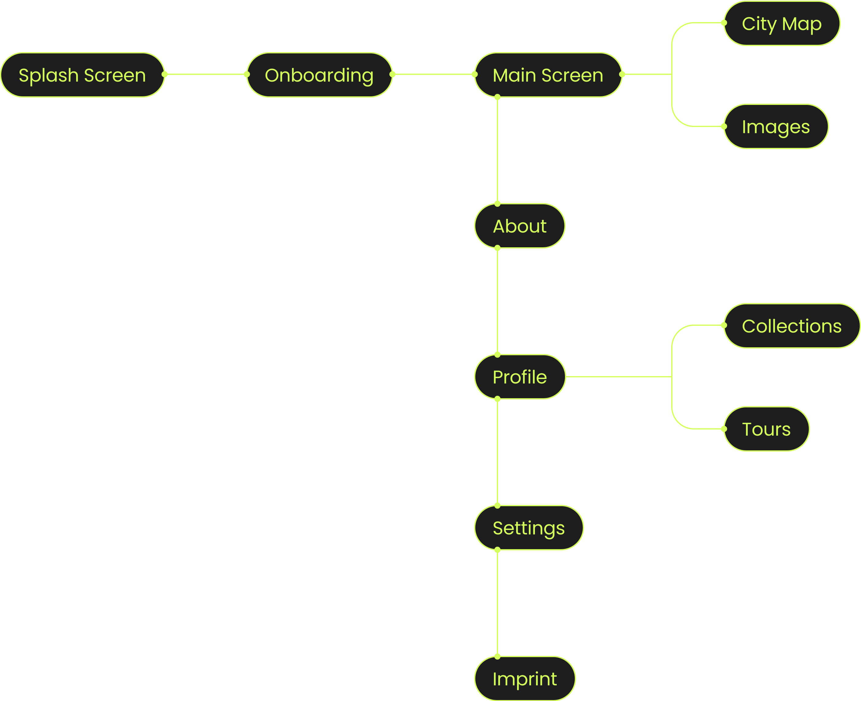
TypeMate is my capstone project from my UX/UI Design Bootcamp, which I completed in 2023. We were given a 3-week timeframe to work independently on our own project, covering everything from research to design. The app is in German as it was developed with Berlin as a prototype. Please note that the images and map data are fictional, with some sourced from the internet.
A scene photo from the TypeMate app on a smartphone, showing a pop-up with a photo of a sign and information about the location.
User Research
Yellow arrow pointing to the right.
Online Survey
Yellow arrow pointing to the right.
Interviews
Yellow arrow pointing to the right.
Affinity Map
Yellow arrow pointing to the right.
Personas
Yellow arrow pointing to the right.
Visual Concept
UI Design
Yellow arrow pointing to the right.
Information Architecture
Yellow arrow pointing to the right.
User Flow
Yellow arrow pointing to the right.
Low-Fidelity Wireframes
Yellow arrow pointing to the right.
Screen Design
Yellow arrow pointing to the right.
UI Kit
Yellow arrow pointing to the right.
Prototype
The design process can be roughly divided into two phases: During the first week, I conducted research to determine how the app should be designed to appeal to potential users. In the second week, I focused on creating the user interface. This involved translating the gathered information into the design, culminating in the development of a high-fidelity prototype. Eventually, the third week was reserved for fine-tuning and finalizing the project.
A scene from the TypeMate app on a smartphone showing the home page with an old photo of store signage.
Online Survey
I started with a survey to determine how I should design the app to attract a broader user base and identify the features needed to make it engaging. It was about exploring the extent to which the topic could be embraced. Approximately 40 people participated.

The findings improved my understanding of the target audience. A significant number of users were young, tech-savvy, and familiar with typography terms. However, there were also people with less knowledge about typography, yet they were interested in the app. The survey results helped me to indicate that these users were more interested in the history of the places.
Interviews
I realized that there were two distinct potential user groups. As a next step, I conducted interviews to figure out how to best address the interests of both groups. I talked with four interviewees who provided valuable insights, allowing me to better comprehend how each of them would make use of the app.
Typography acts as a mirror for the design vibes of its time, giving us a peek into the mindset of the era. Me? I'm just naturally curious about the history of my hood.
Alex, 35 (Software Developer)
I'm not a designer or font expert, but I can still get a feel for the time period a font belongs to, and that's kind of neat. And well, I think it's cool to know the backstory of it.
Sophie, 27 (Teacher)
I would use the app to gather new inspiration when I'm searching for a font to incorporate into a design. I've seen the typical typographic websites more than enough.
Lucas, 31 (Designer)
"Originally fascinated by old store signs, I realized it was about documenting and collecting all forms of urban typography."
Personas
Persona 1 would use the app in a more passive manner, typically in a design context during work when searching for fonts and inspiration. This persona is tired of the usual typography websites and struggles to find new inspiration. They seek fonts with a deeper meaning to establish a more profound connection when using typography for projects.
Persona 2 is drawn to urban typography, but primarily due to its historical significance. This persona is an explorer of the city, characterized by spontaneity and a go-with-the-flow attitude. They are particularly frustrated by the lack of attention and neglect of signs, some of which are even disappearing. Therefore, they aim to preserve information about them in some way.
Portrait of a young man working on his laptop.Portrait of a young woman with glasses.
Danny Designer
“We often forget that inspiration can be found in everyday life. I am constantly seeking new ways to broaden my perspective.”
A schematic representation of the motivation of persona 1.
Emily Explorer
A schematic representation of the personality of Persona 2.
Persona 1 would use the app in a more passive manner, typically in a design context during work when searching for fonts and inspiration. This persona is tired of the usual typography websites and struggles to find new inspiration. They seek fonts with a deeper meaning to establish a more profound connection when using typography for projects.
Portrait of a young man working on his laptop.
Danny Designer
“We often forget that inspiration can be found in everyday life. I am constantly seeking new ways to broaden my perspective.”
A schematic representation of the motivation of persona 1.
Persona 2 is drawn to urban typography, but primarily due to its historical significance. This persona is an explorer of the city, characterized by spontaneity and a go-with-the-flow attitude. They are particularly frustrated by the lack of attention and neglect of signs, some of which are even disappearing. Therefore, they aim to preserve information about them in some way.
Portrait of a young woman with glasses.
Emily Explorer
A schematic representation of the personality of Persona 2.
Visual Concept
Due to my research, I was able to refine the concept of my app. I decided to expand the collection to include any enduring typography within the urban space. The primary focus is on documenting and preserving signs while also capturing the fonts. Each sign will have a subpage with relevant information. The app will offer both a map with pins and a visual overview, featuring images of the signs. Users will have the ability to apply filters for better navigation.
Challenge
Even though I had a clear concept in place, it became evident that I needed to address the needs of two distinct user groups. It felt like I was tasked with designing two separate apps. The challenge was creating an application that serves as an inspiration source for some users while functioning as an interactive city discovery tool for others.
A scene photo from the TypeMate app on a smartphone, showing a pictorial list of store signage.
Information Architecture
I started by outlining a simplified and understandable information architecture, figuring out how to fit in all the features users wanted while emphasizing the two core functions: inspiration and city exploration.
A simple representation of the information architecture of the TypeMate app.
Low-Fidelity Wireframes
An excerpt from the low fidelity wire frames created for the TypeMate app.
While creating the low-fidelity wireframes, I underwent a series of trials to understand how to structure the interface seamlessly, ensuring it doesn't give the impression of two distinct apps bundled within one. As the amount of wireframes is quite extensive, I only show part of the main flow.
Colors
Display of the colors used in the TypeMate app.
Typography
Typography used in the TypeMate app.
Iconography
Icons used in the TypeMate app.
Grid
The dimensions of the grid for the mobile screen used in the TypeMate app.
A scene photo from the TypeMate app on a smartphone, showing popular typography and signs as a suggestion for the user.
A selection of screen designs from the TypeMate app.
"TypeMate embodies my personal vision of an app that facilitates the exploration of urban typography while saving its history."
High-Fidelity-Prototype